
Lars Zoer
Archive,About,Contact
Archive
Capital advisory identity/Zürich · Singapore/2026

Aexen

A single-asset wordmark and identity system for a Zürich capital-advisory firm — built for a market where polish reads as compensation, and restraint is the only credible signal.

Aexen wordmark
Client
Aexen AG
Sector
Capital advisory · deep-tech
Scope
Identity, type & colour, guidelines, applications
Year
2026
01 — The brief

Aexen was losing pitches to firms with weaker thinking but stronger presentation. In the post-mortems, one phrase kept surfacing: “felt less established than the others in the room.” That is a branding failure, not a strategy failure.
02 — The market

The people who hire Aexen are not impressed by branding. They are suspicious of it.

Sovereign-wealth CIOs and family-office principals read polish as compensation. Clients arrive already referred — by the time anyone sees the deck, they have been told Aexen is good. So the brand’s job isn’t to persuade; it’s to give an already-warm prospect zero reason to hesitate. That inverts the usual logic: most identities are built to convince — this one is built to reassure, and to not erode trust that has already been transferred.

03 — The strategic decision

Old-world discretion, expressed through new-world craft.

Position the brand between Lazard and Lux — the discretion of an old advisory house, drawn with the precision of a contemporary studio. Swissness as discipline, not as flag: it lives in the typographic precision and the grid, never in literal symbolism. The aesthetic is non-performance — quiet enough that people lean in.

The single idea
“Capital that thinks in decades deserves counsel that does the same.”

Not a tagline — it never appears in marketing. It is the internal compass for every decision the brand makes.

04 — The mark

An arrow hidden in the name.

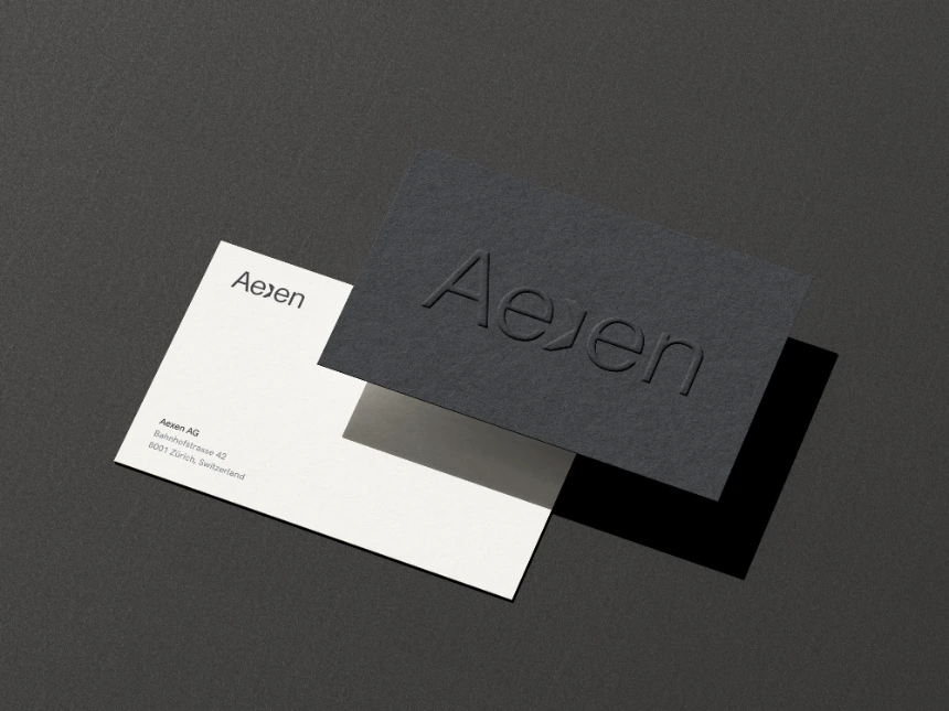
Aexen wordmark — the X as a forward arrow

The X is the only letter in “Aexen” that breaks the rhythm of an otherwise vowel-heavy word. So the intervention lands there: the X fuses with the adjacent e in one fluid transition, the two letterforms flowing into a single shape rather than sitting side by side.

Read again, that same shape becomes an arrow pointing forward — the firm’s whole posture in one mark. Aexen is about moving forward, and making sure it works.

On the absence of a symbol

Aexen is deliberately a single-asset identity — no secondary monogram. It lives on letterheads, deck covers and the plate at reception, never as a 16-pixel app icon, so the wordmark fits everywhere it needs to. The absence is itself a positioning signal: a wordmark confident enough to stand alone.

05 — The system

Hierarchy done with typography, not colour.

Primary — Neue Haas Grotesk
Aa
Swiss modernist lineage, without the cliché. Wordmark and headlines.
Secondary — Söhne & Söhne Mono
Aa
Editorial long-form for body. Mono carries metadata — the quiet system under the system.
Aexen Ink
#0E1116 · wordmark, headlines, text
Bone
#F4F1EA · background for everything
Slate
#5C6470 · secondary text, rules, data

Three colours, deliberately small — and no accent or call-to-action colour anywhere in the system. In this category, emphasis comes from weight and white space, not from a brighter blue. Ink on Bone clears 14.8:1; the restraint is the point.

06 — Application

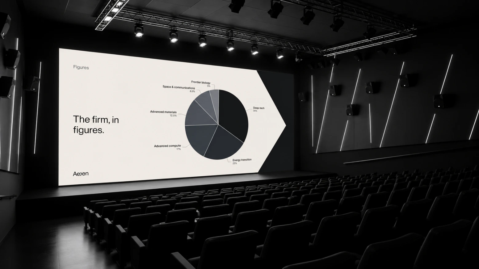
Four artefacts, each at full polish.

Depth over breadth. No swag — the brand lives in objects that age with it, not merchandise that markets it.

Pitch deck template
Pitch deck template
Letterpress business card
Socials
07 — My role

Brand foundations end to end — positioning, the wordmark and split-X construction, the type and colour system, a focused guidelines document, and the hero applications. Verbal identity was set as art direction for Aexen’s internal communications lead to carry forward.

08 — Why it works

The absence of the usual trust signals is itself the trust signal.

Next project
One-Motion Banking
Fintech identity