
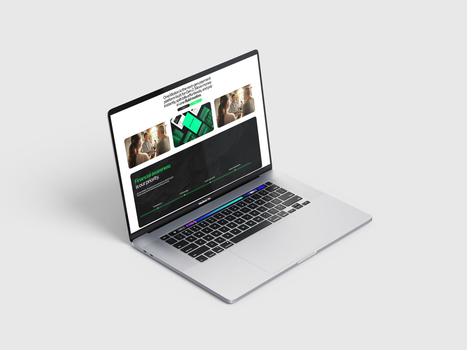
One Motion is a consumer-fintech app for a new generation: a secure, easy way to move money, split bills and pay. The brand lives in-product, at 60fps, so it could never be a static logo dropped on top. It had to be born moving.
Most identities are drawn to sit still, then animated later. Here the opposite was true: the brand had to work first as motion, at product speed, and only then hold as a static mark. It needed a system calm enough to live under real money, and alive enough to feel like the app itself.
Make the mark a verb, not a noun. One continuous, angled motion, an O leaning into three forward strokes: money, already moving. One stroke weight, one forward path, and green reserved for the single moment money moves.
Every interaction should reward. Motion is quick and springy — never decorative for its own sake. These specimens are live.
It moves the way the product moves, so the brand feels like the app rather than a sticker on top of it. Motion is the identity, which is why One-Motion reads as one system from the logo to the interface.