
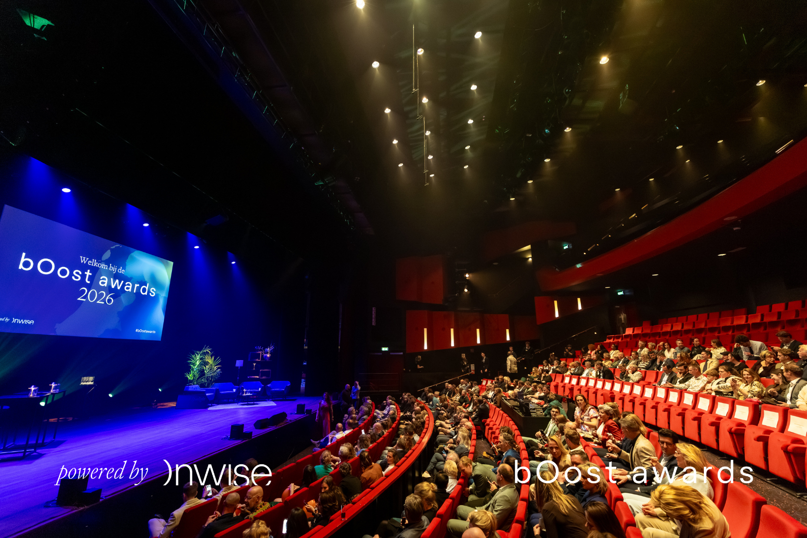
So much of what makes Oost-Nederland special never gets a stage, and the people building the region rarely grab the spotlight themselves. bOost needed a brand that does it for them, and not just for one night: the identity carries a whole season, from nominations to the live show.
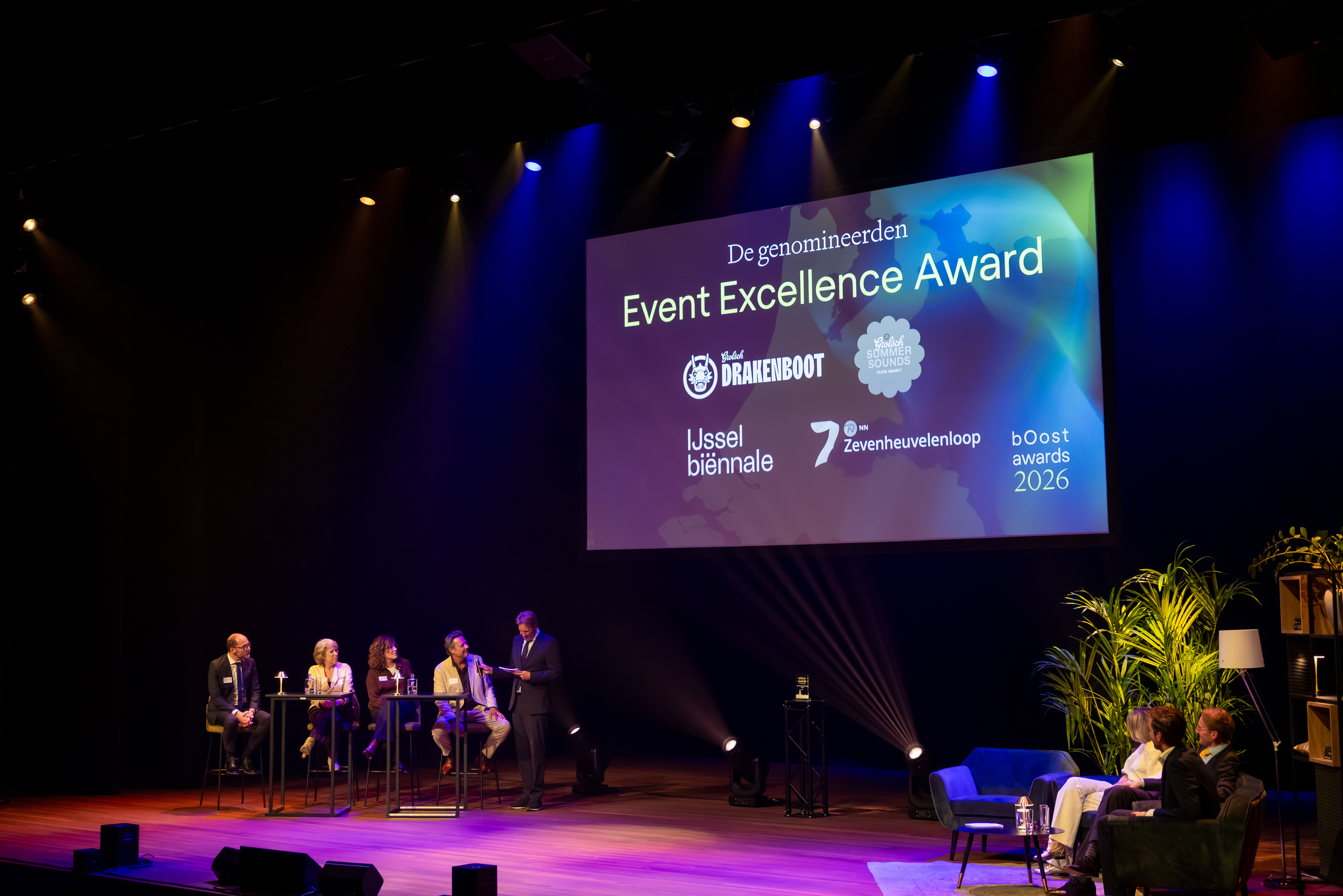
One identity had to hold five awards, an independent jury and regional press across a full season. It scales from a small nomination badge to a stage-width backdrop, survives projection, print and a vertical recap reel, and stays celebratory without ever pulling focus from the names being honoured.
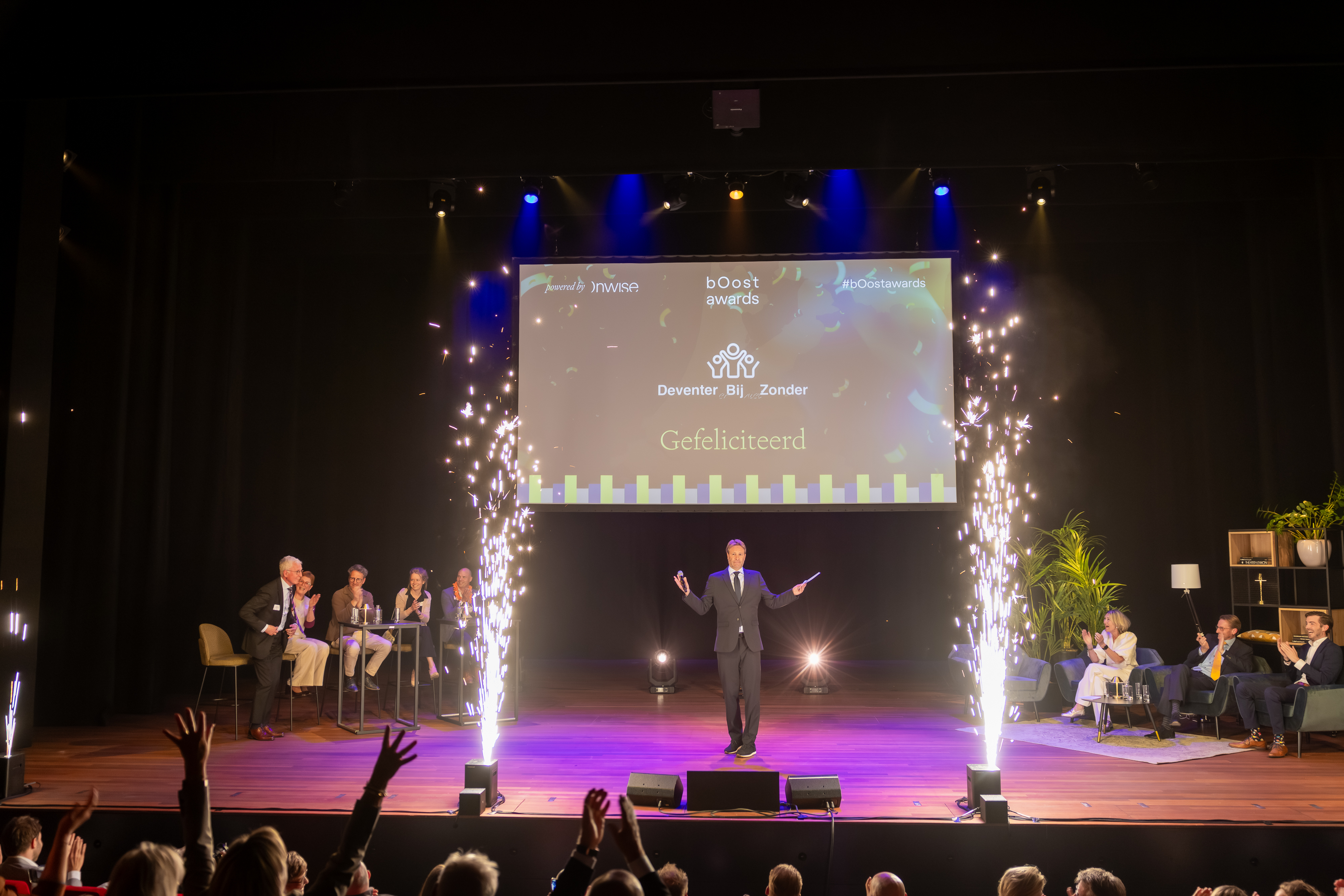
Build a system that turns up the volume. The whole identity is built around a lowercase mark with fresh lime energy against a calm near-black, and a clear blue that carries the map of Oost-Nederland. The energy does the shouting, so the winners don’t have to.
The event flyer
The invitation that opened the season, the same system folded down to a piece you can hold.
It puts Oost-Nederland in the spotlight and gives the region an award worth winning. The first edition sold out, so the next one had a stage worth showing up for.