Wordmark
The refreshed logo builds on the existing name and colours, with Fastens every industry as part of the lockup.
Hetraco engineers custom fasteners for heavy industry, petrochemical, maritime and offshore, one piece or a full series, made to spec in Apeldoorn. When a line stops for a missing part, they are the call that gets it moving. Their identity said none of that.
The buyer is a head of purchasing under pressure, looking for a supplier who thinks along instead of one who quotes. Hetraco had the stock, the thread-rolling expertise and the reputation, but an identity that read as a generic supplier. The risk in fixing it was sounding technical to the point of jargon. It had to carry specialist weight and still sound like people.
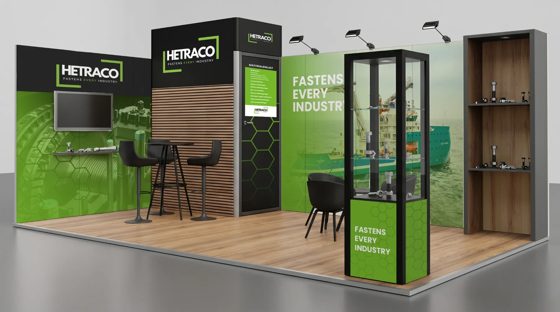
The strategist landed the positioning on one claim: Fastens every industry. My decision was to stop treating it as a tagline and carry it everywhere the brand shows up. It sits with the wordmark, on the stand, across the site. The claim can’t be dropped from the identity, because it is the identity.
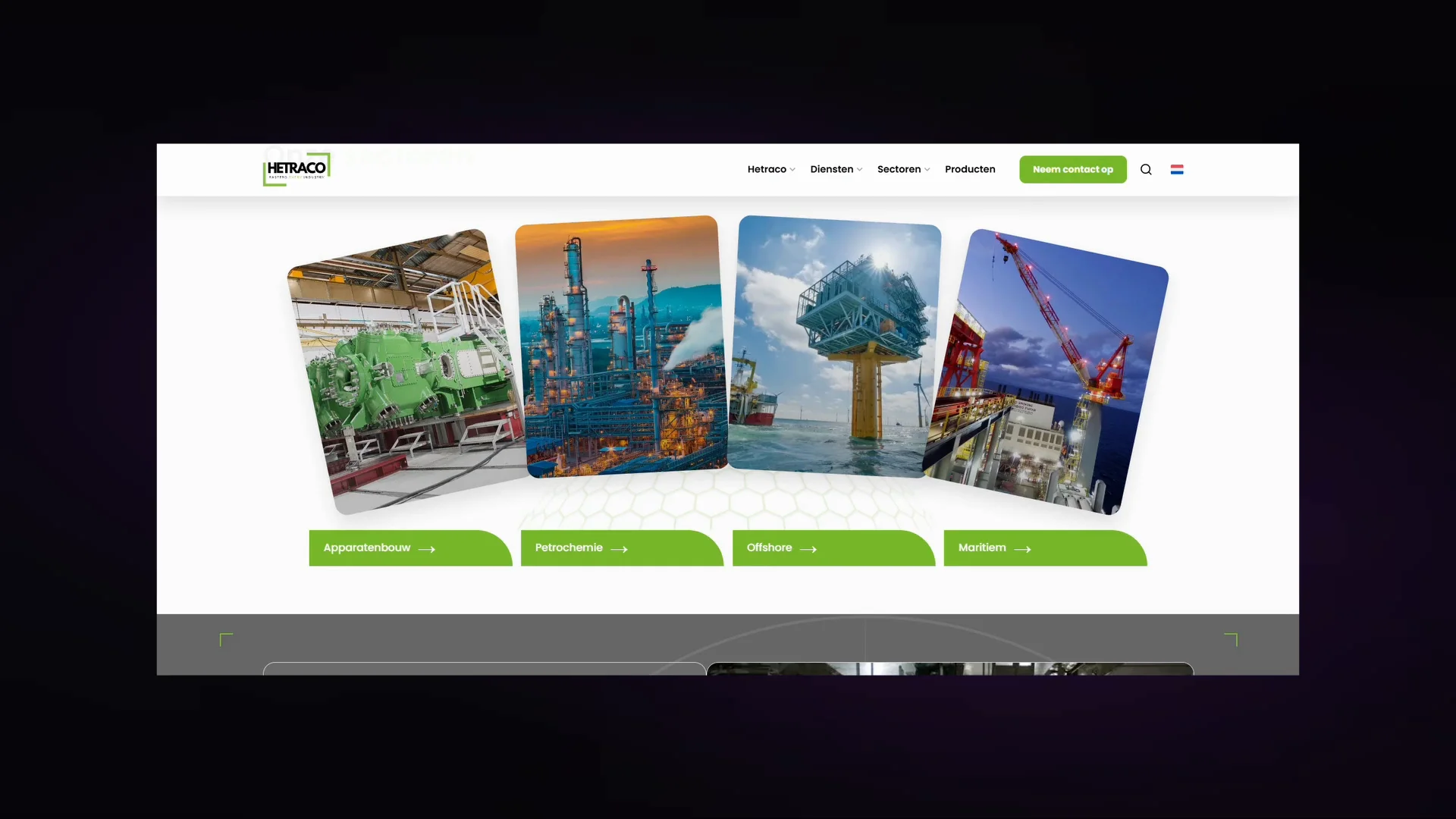
The wordmark and statement connect an industrial identity with direct language, real working environments and functional illustrations.
The refreshed logo builds on the existing name and colours, with Fastens every industry as part of the lockup.
Green, grey, black and white connect the wordmark, website and applications. These values are the palette used in this case.
Poppins leads the current digital identity.
The supplied brandbook also lists Menlo, Monaco and monospace references. The current portfolio presentation retains its more recent Poppins direction.
Fastens every industry.
Short, active sentences. Practical, involved and knowledgeable, with technical expertise expressed in understandable language.
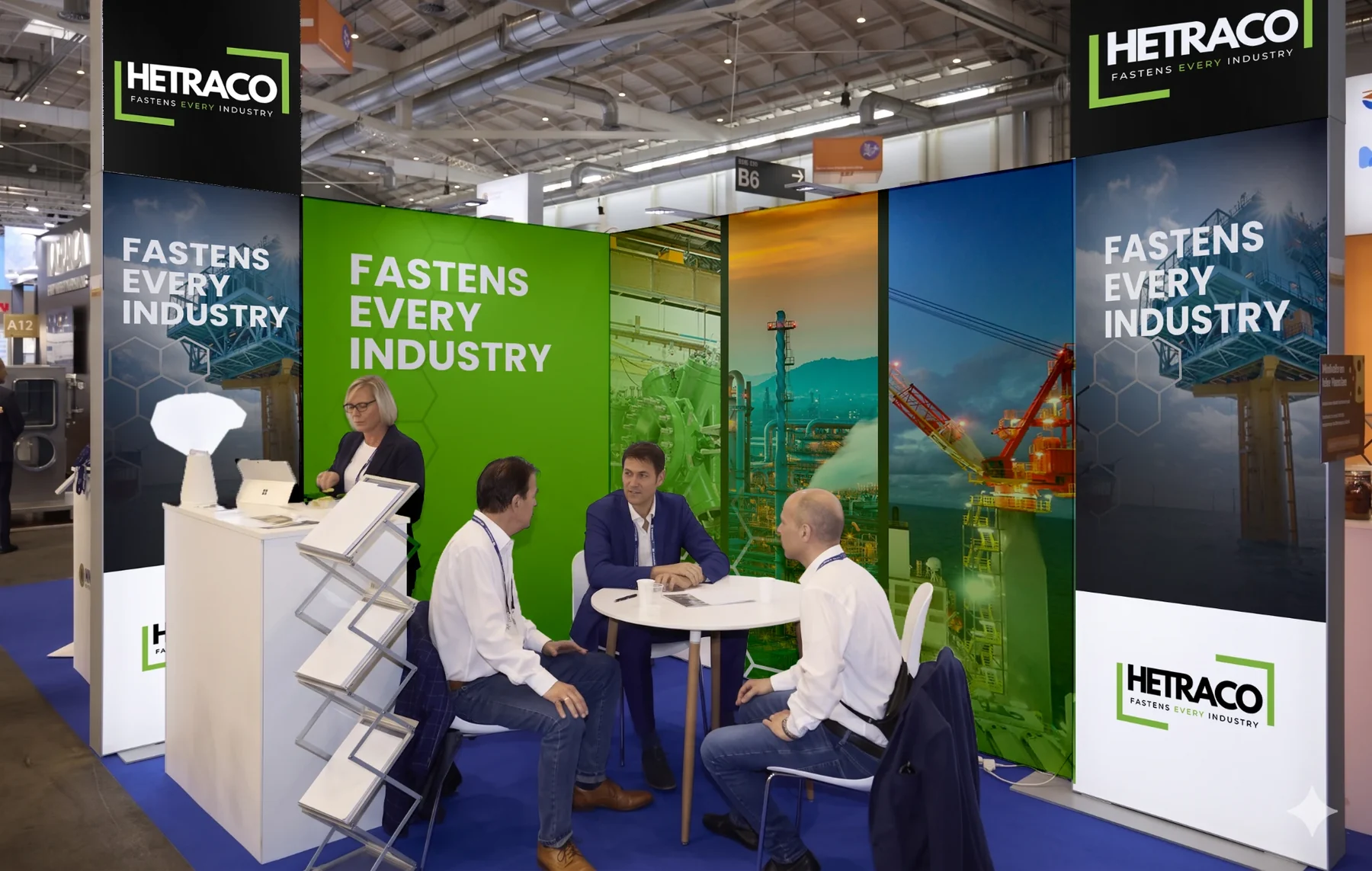
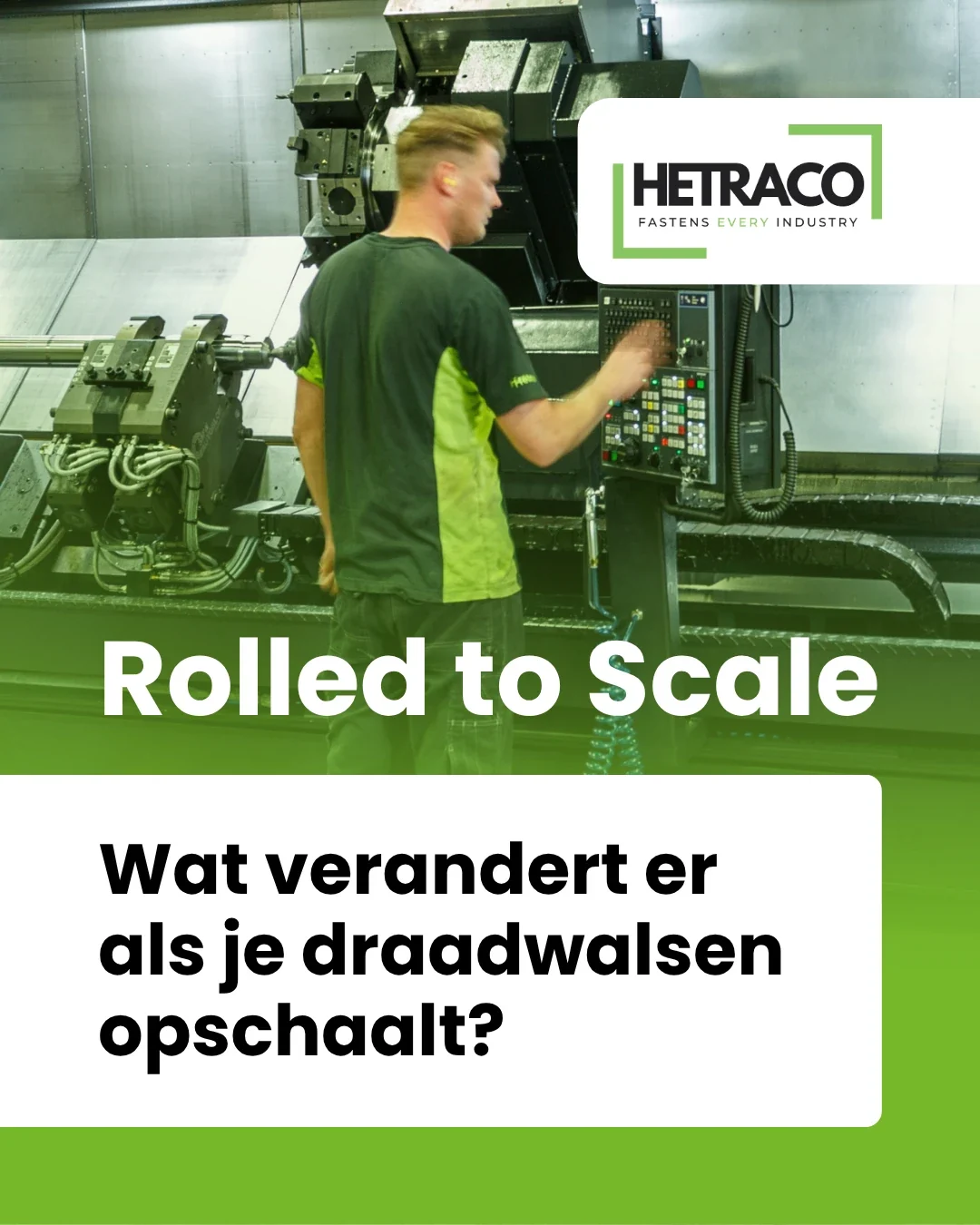
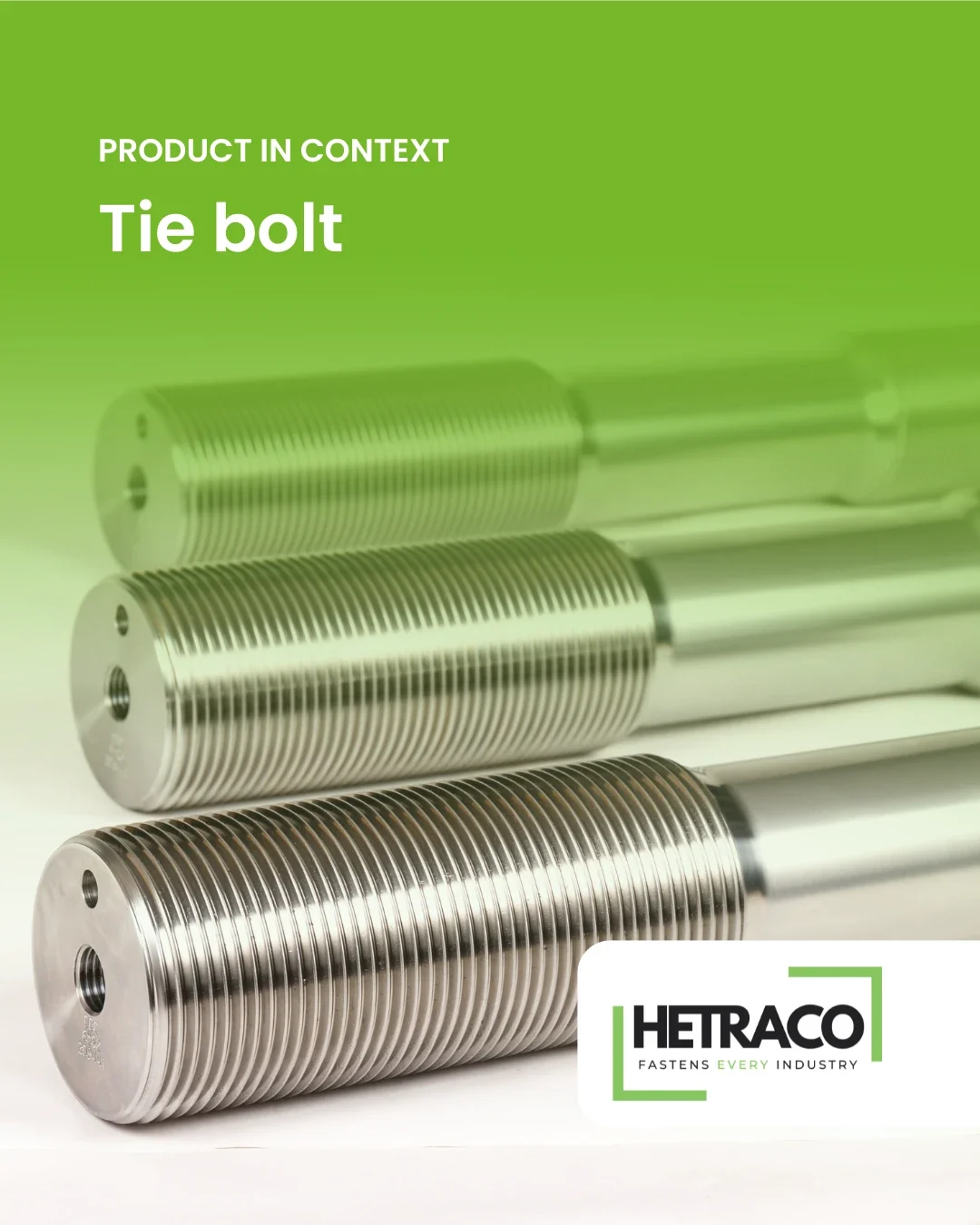
The image direction calls for real situations, people at work, machines and products in context rather than polished stock imagery.
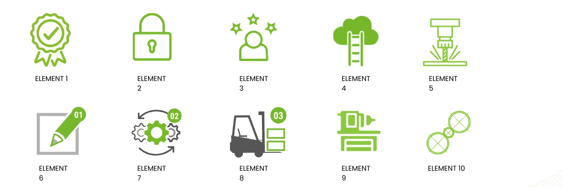
Green line illustrations and grey industrial shapes form a functional visual vocabulary. The original illustrations are shown rather than redrawn.
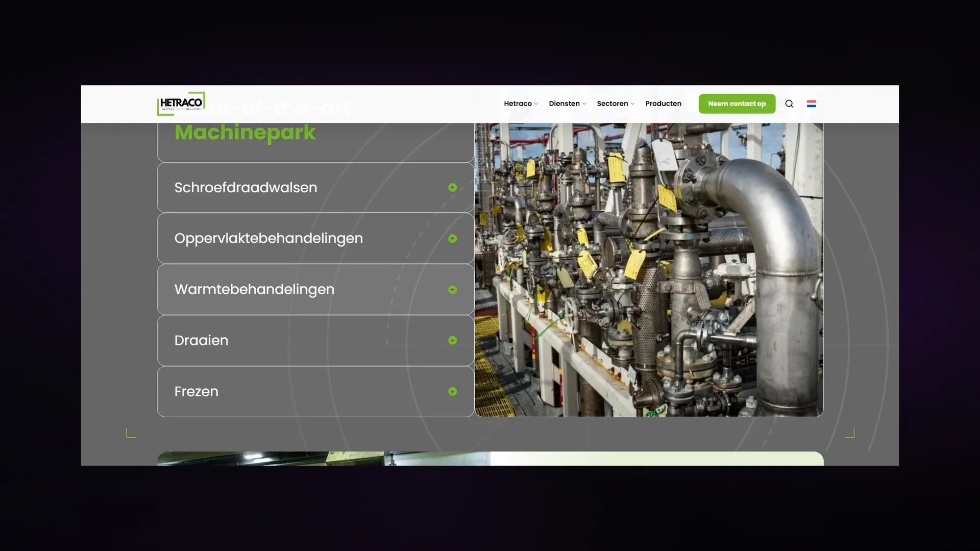
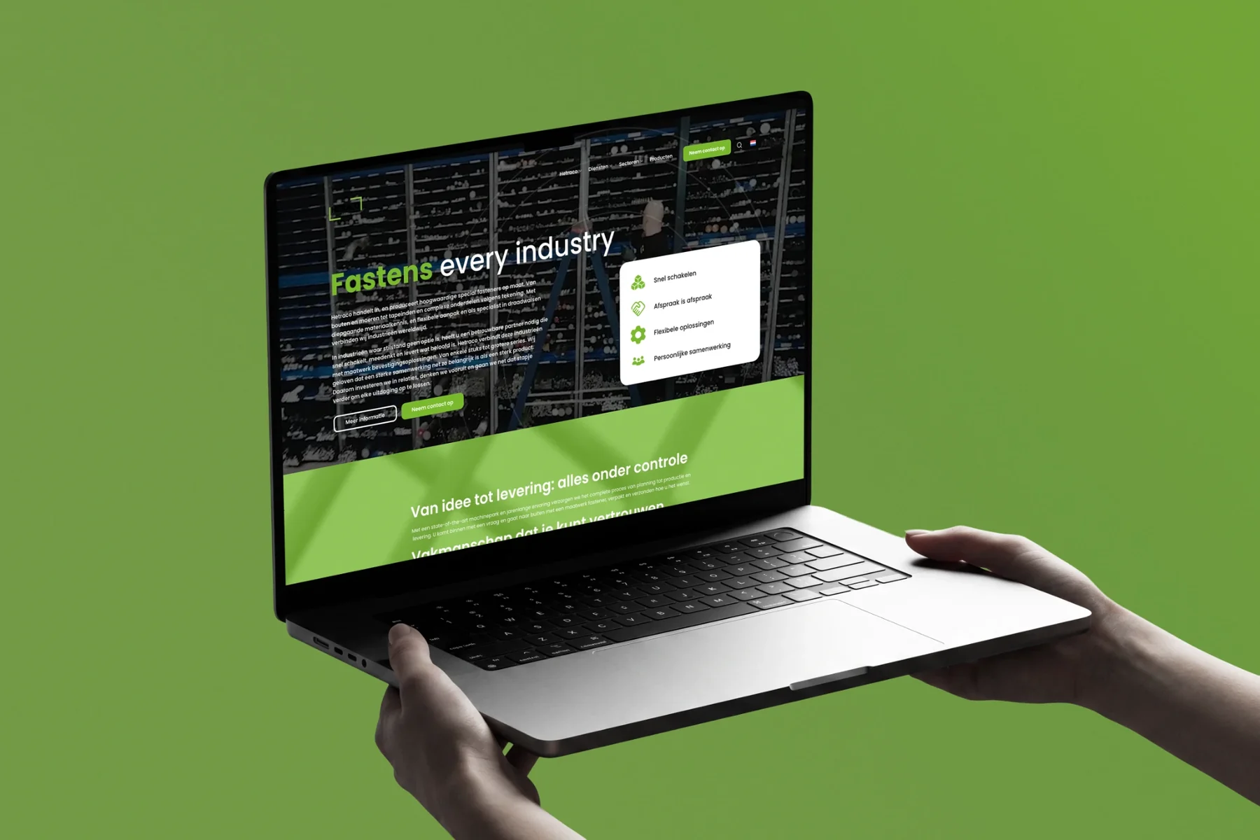
The statement connects the wordmark, exhibition stand and website. The case shows how green, clear typography and industrial imagery carry the same identity from the stand to the screen.