
Wordmark


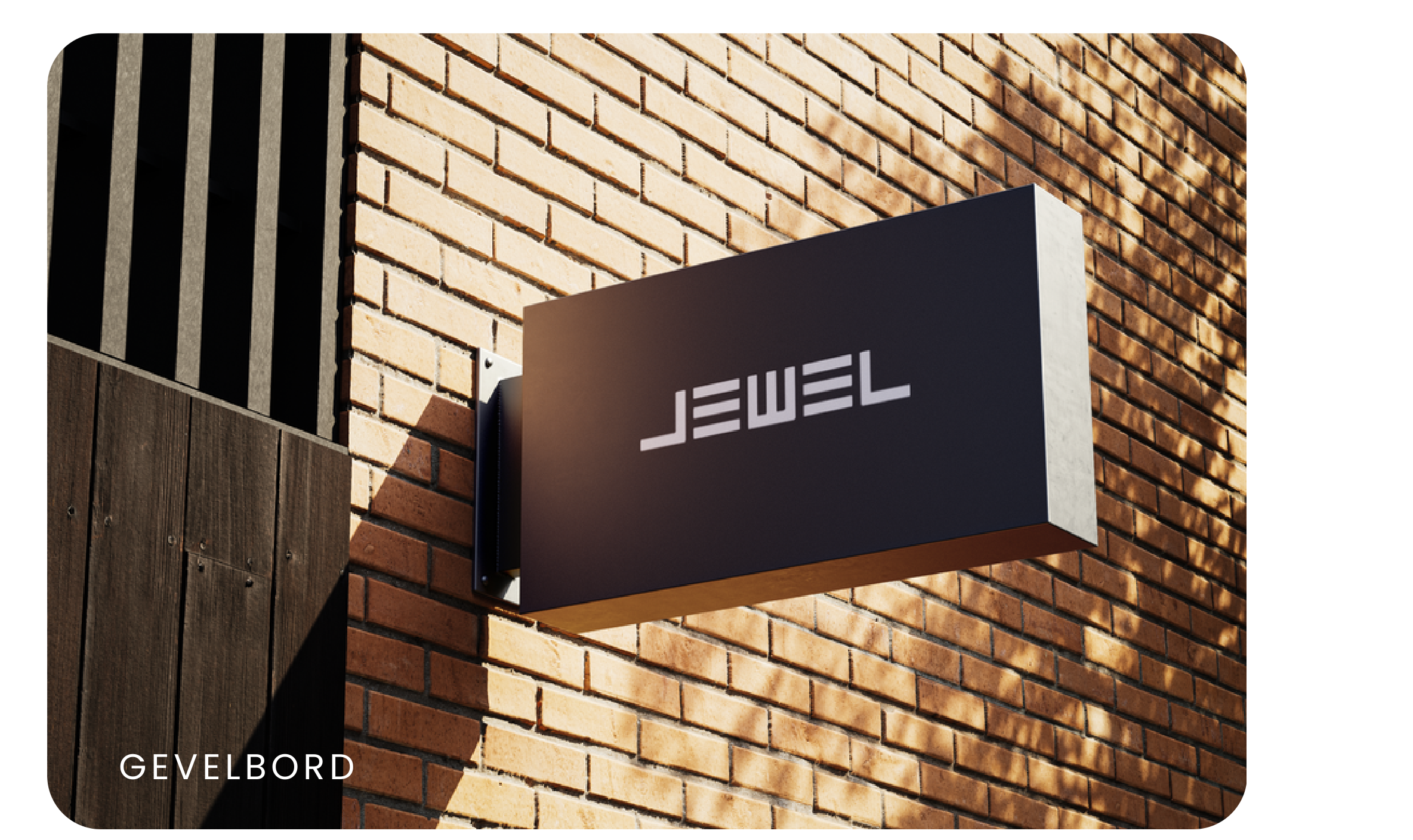
The wordmark stays black or white, with its proportions intact and clear space around it.
JEWEL had deep technical expertise but an identity that no longer matched it. It sells nothing off the shelf, solving the window-covering questions others walk away from, always through the project furnisher rather than the end client. The old branding was dated and no longer reached the audience it needed.
The buyers are project furnishers fitting out hospitals, care homes and offices, people who want the window-covering problem taken off their plate so they can focus on the whole design. The brand had to read as a specialist that knows: technical where it counts, human everywhere else, without ever sounding distant.
We moved JEWEL toward a calm, premium and architectural 2026 system, monochrome and photography-led, so it carries the same authority JEWEL has in the room. It runs on one line, wij lossen het op, always in Poppins and always tied to what it delivers. Less selling, more proof.
A monochrome identity built around a single type family, architectural photography and functional elements.
The wordmark stays black or white, with its proportions intact and clear space around it.
No accent colour or gradients in the identity. Colour comes from photography.
Poppins. One family, with a role for each weight.
Wij lossen het op.
Calm, clear and concrete. Technical where necessary, understandable wherever possible. JEWEL is always written in uppercase.
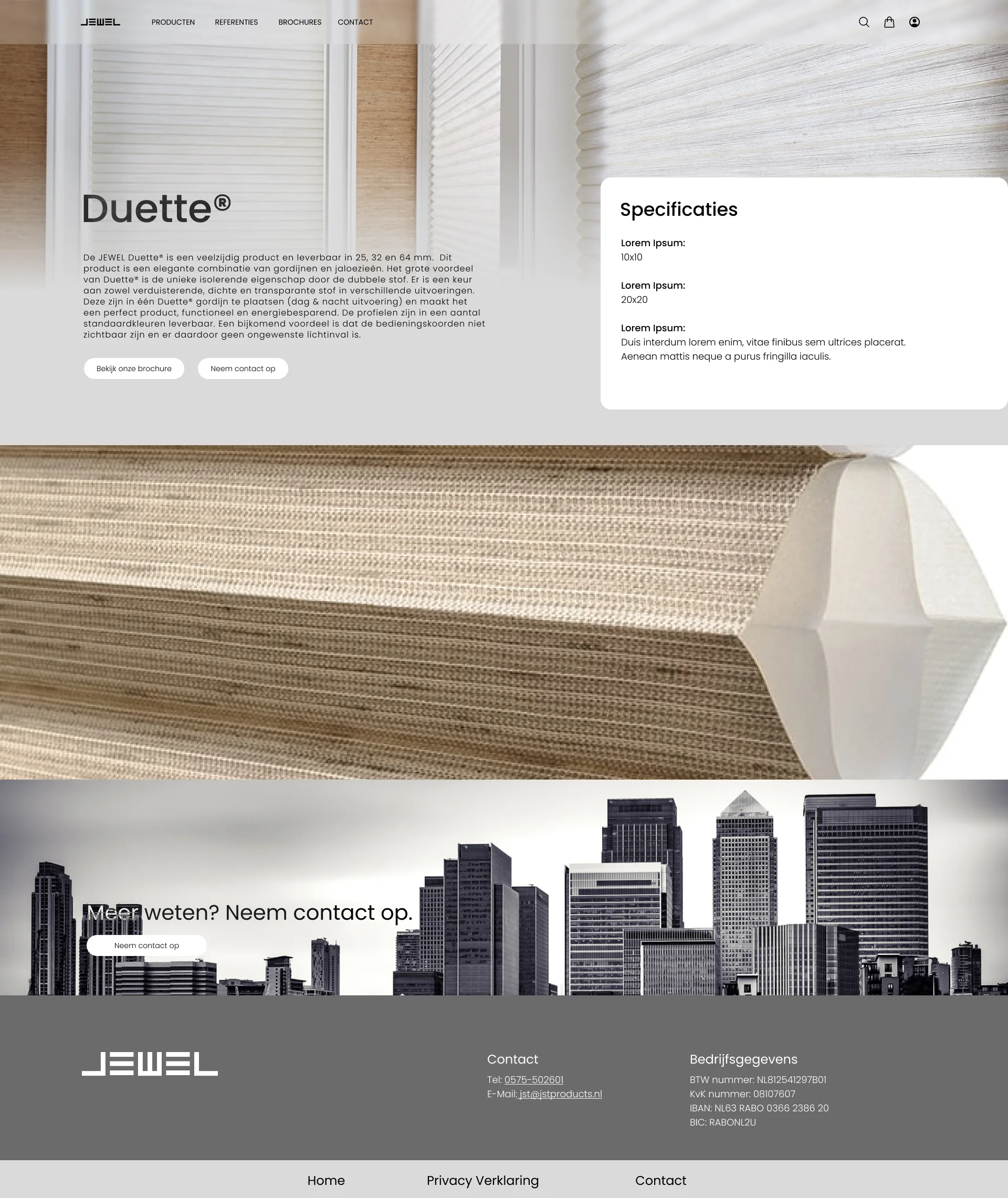
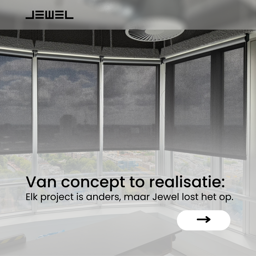
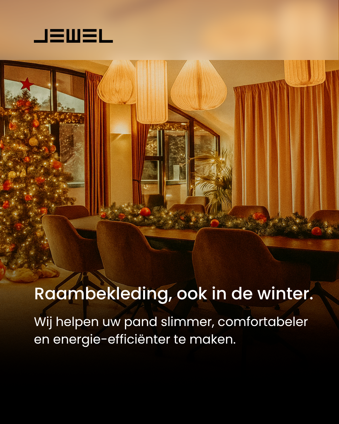
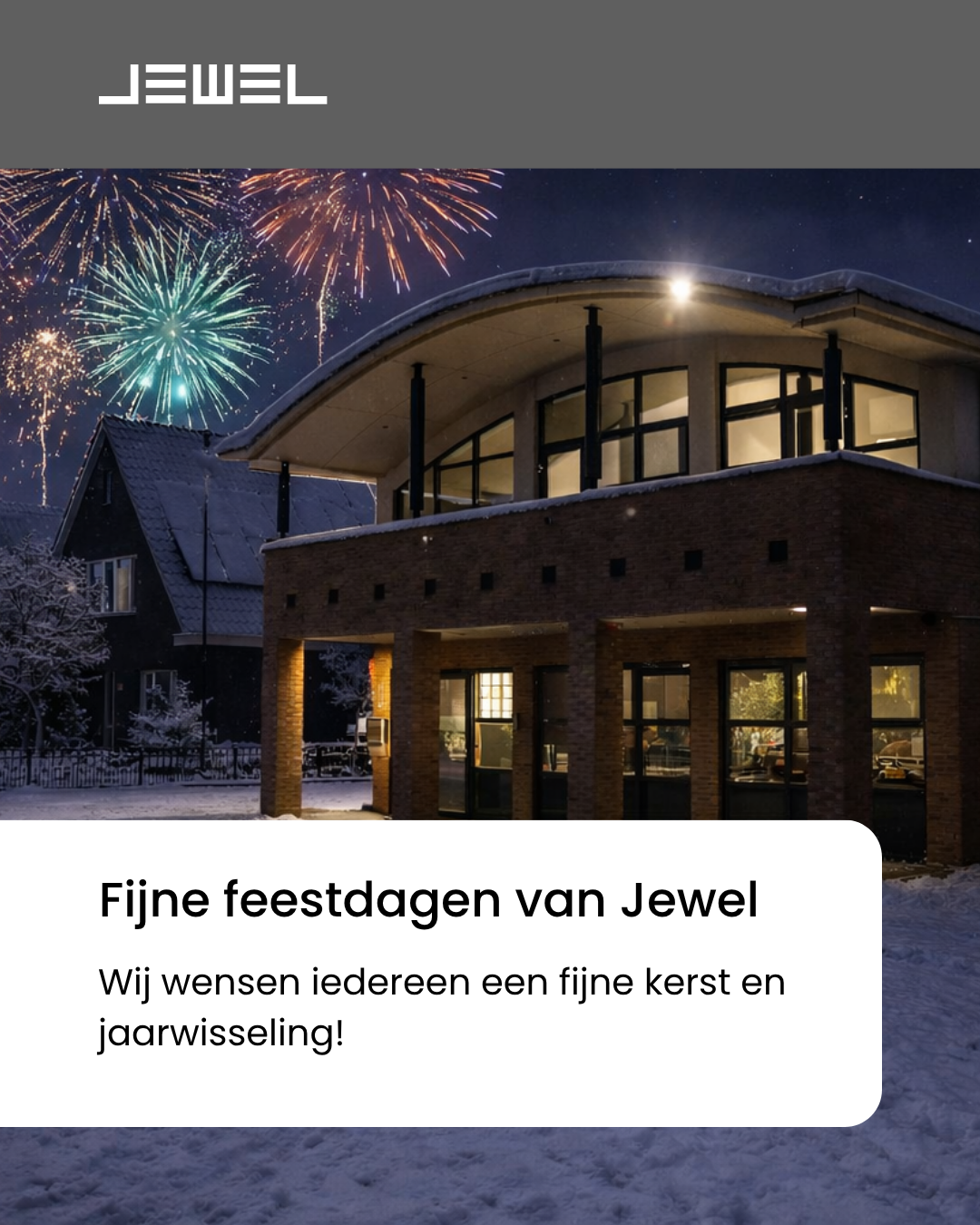
The image direction calls for real products and applications, natural daylight and warm tones, with no stock photography.
20px cards, 100px pills, fine dividers and a recurring arrow. Each element has a function.
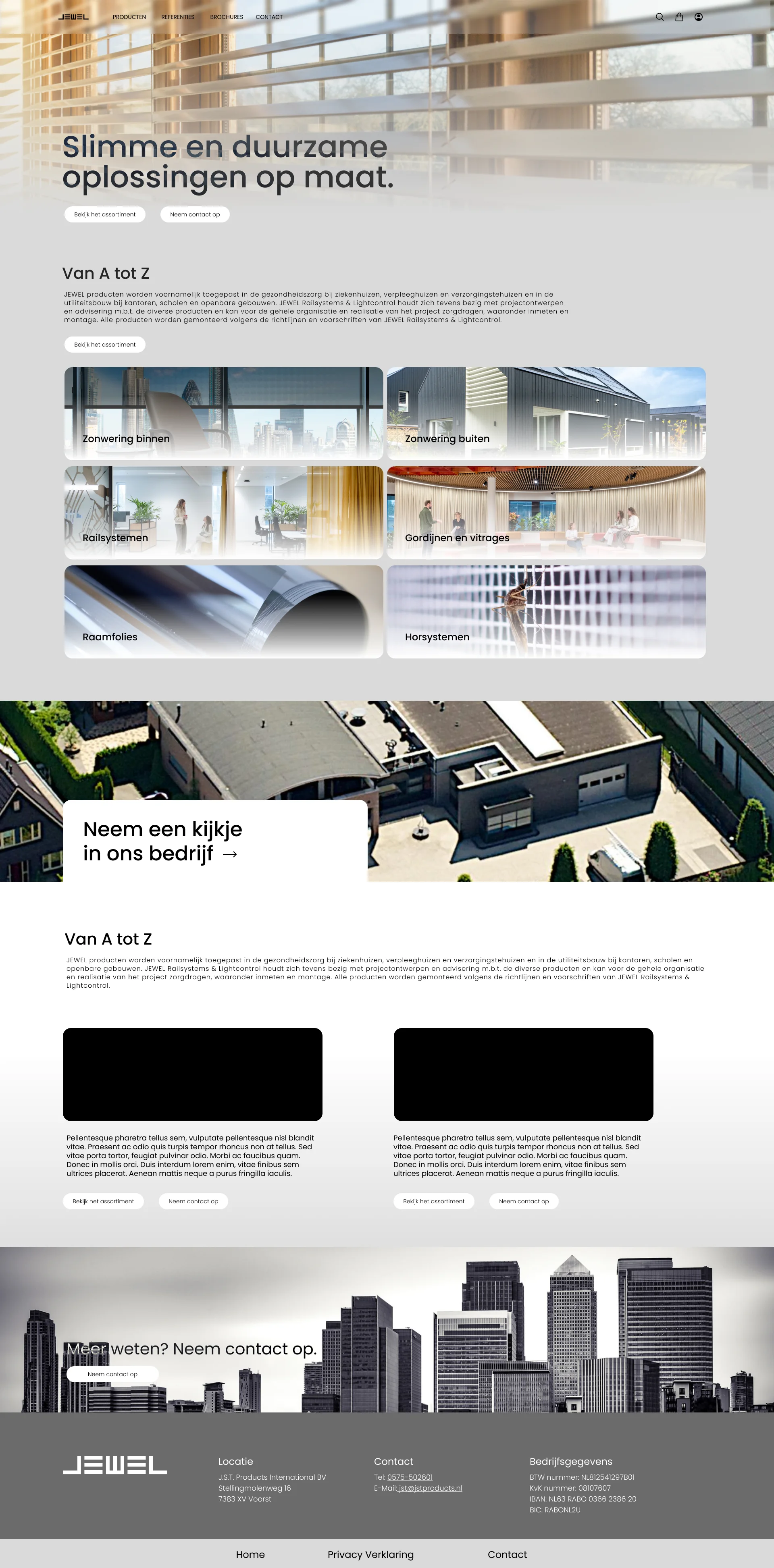
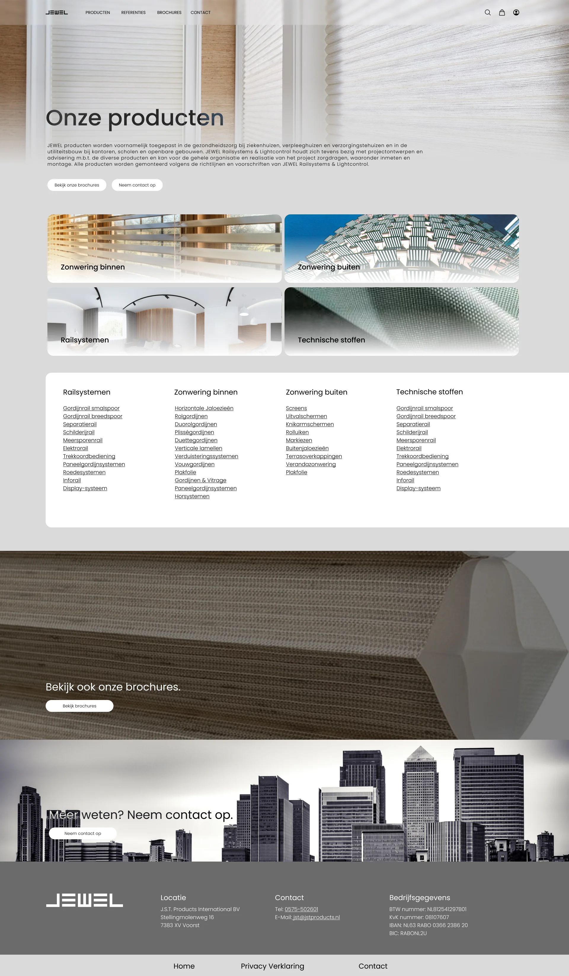
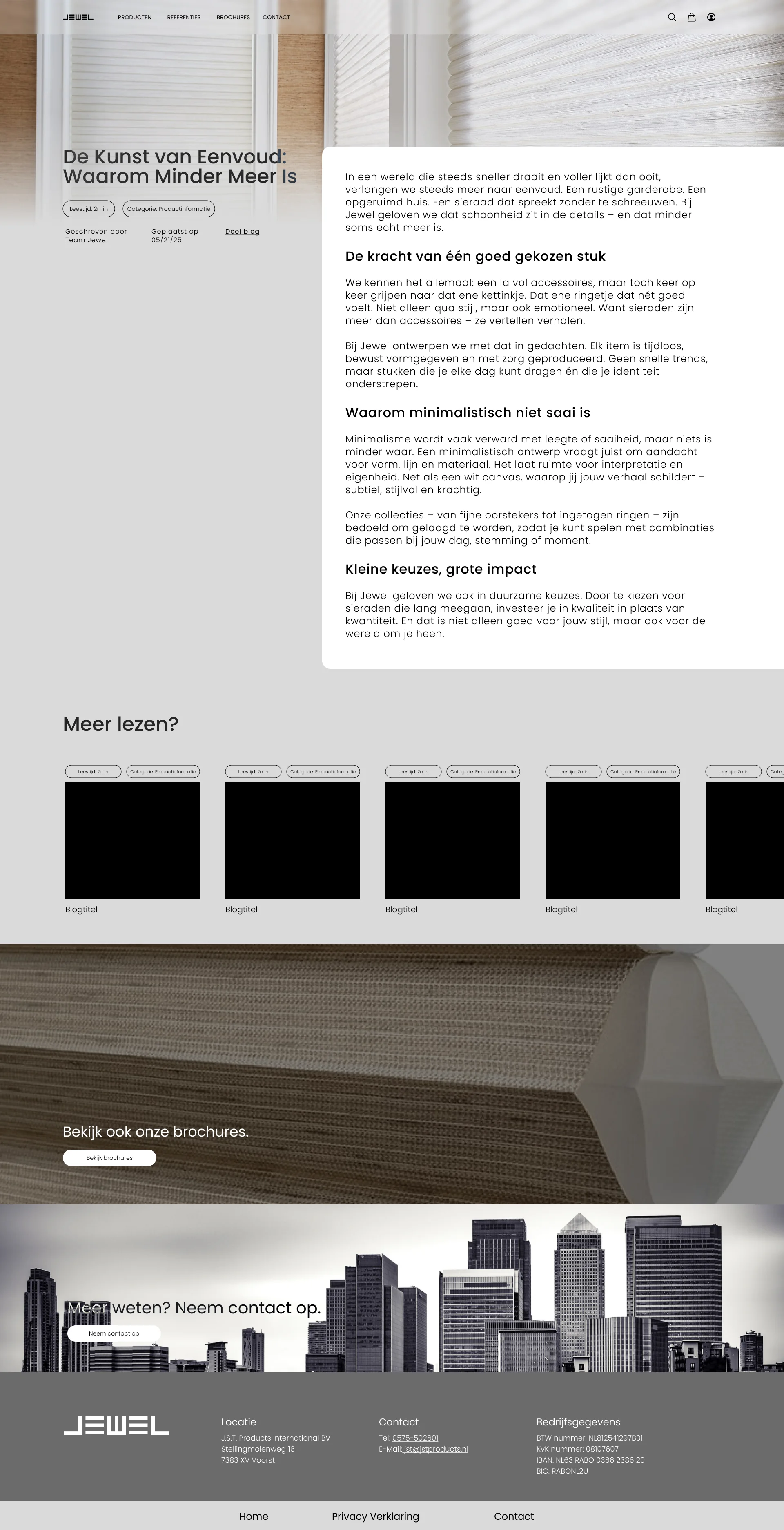
It makes JEWEL look like a company that knows exactly what it stands for. That clarity is precisely what the brand was missing, and now it carries across every window covering they sell.