Wordmark
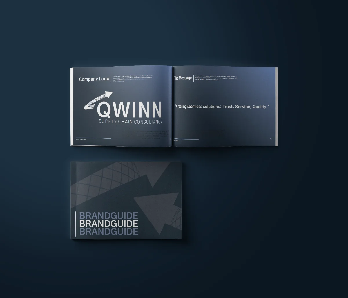
The original guide calls for clear space and a gradient globe, with exceptions for monochrome printing. The two existing identity assets show the change in name.
Qwinn turns supply-chain strategy into results, optimising processes and acting as an extension of their clients’ leadership teams rather than outside advisors. I was brought in to give that expertise a face, first as Qwinn Consultancy and then through the rename that followed.
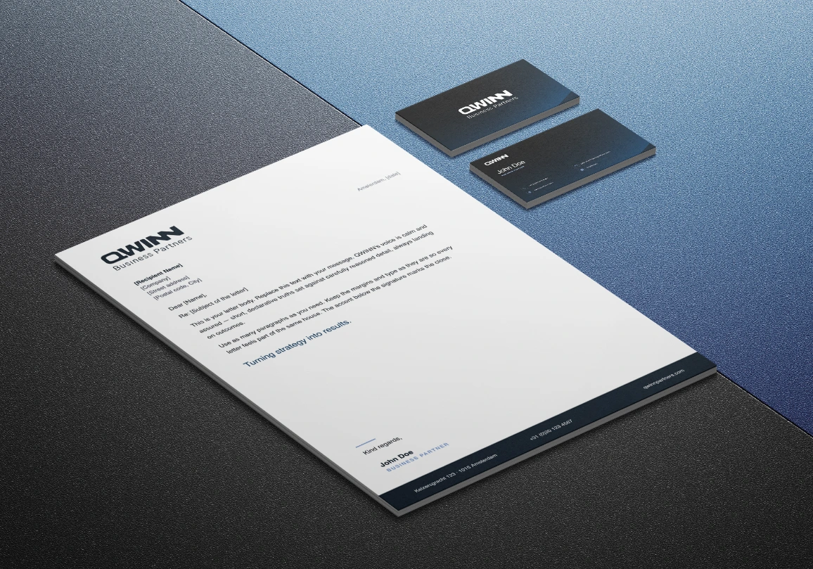
Then the company rebranded: Qwinn Consultancy became Qwinn Business Partners, and the existing logo no longer matched the name above the door. The original identity already carried real recognition with clients, so starting from a blank page would have thrown that equity away. The brief was to evolve, not erase.
Evolve the language, don’t replace it. Building on the Consultancy identity, I redesigned the logo to fit the Business Partners name and carried the gradient globe forward, the one shape clients already read as Qwinn. The blues deepened into a more authoritative navy: the same Qwinn, levelled up.
The Consultancy guide establishes the original logo, palette and typography. The current Business Partners case carries that language into a renamed identity and a separate website concept.
The original guide calls for clear space and a gradient globe, with exceptions for monochrome printing. The two existing identity assets show the change in name.
The four colours specified in the Consultancy guide. They document the earlier identity, rather than overwrite the current Business Partners palette.
Gothic A1 and Roboto, with distinct roles.
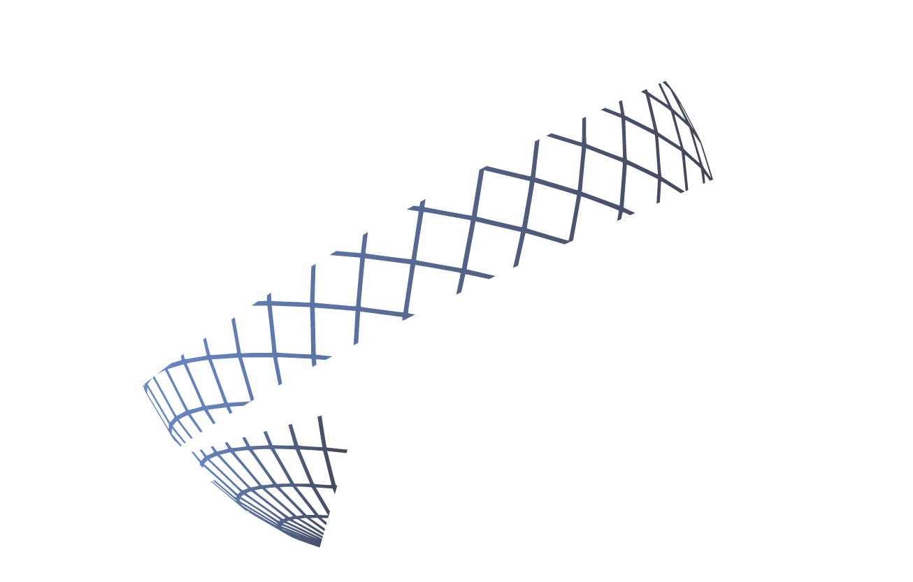
The globe links the earlier identity to the current case. Its gradient and directional forms are part of the original visual language.

The guide uses arrow and globe forms as supporting graphics. These original shapes show the system behind the logo, alongside the current applications below.
The existing Business Partners case uses deeper navy tones. These are current case values, not specifications from the Consultancy guide. The 2026 website shown below remains a concept.
The original guide and current applications show how the globe and typographic language carry through a name change. The 2026 website concept explores a further digital expression of that identity.